∾

It all started on a sultry and turbulent night of June 2012. Crushed and flattened by the state of sites of knowledge in India: recurrent institutional counter-productivity and overwhelming political and network-based agendas. And a vision. There must be spaces for talented and inspired thinker-actors to come and bring to fruition all possible ideas. Without any contact, without any bootlicking. It had to be possible. A large vision, combining spiritual dreams and practical effects. A few months of refining. The birth and growth of a skilled crew, the LĪLĀ band. A registration.* A few bribes adroitly avoided. And a foundation, finally. LĪLĀ, the Luminous Idea of Life Appreciation. A cultural trust. Sometimes dreams pass dawn.
* Regn. No. 1226, Delhi, registered on the Indian festival of Rakshabhandan, August 2nd, 2012.
∾

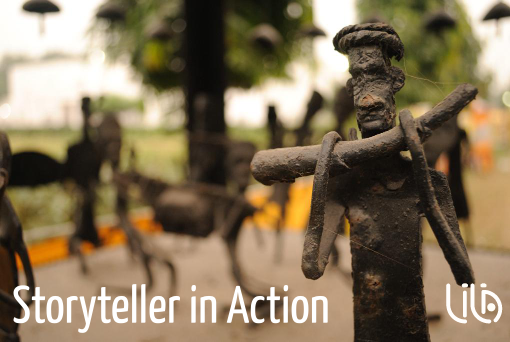
What is LĪLĀ? In India, LĪLĀ is the word for ‘play’. It refers to the spirit of music, to the rhythm of movements. Figuratively, the term has also been used to designate the cadence of life, the musicality of life’s continuous flow. LĪLĀ is the play of the versatile, the creative faculty of the adaptable being, the belief in happiness freed from attachment.

Inspired by various traditions from across borders, the fundamental belief of LĪLĀ is that life is a creative play, as evoked by our name. Creation, and re-creation, are at the heart of the process of life, engendering at once its uniqueness and diversity. We celebrate the human genius for association and interlink, allowing us today to integrate apparent opposites such as play and work, imagination and reason… Such fluidity requires individuals and communities to responsibly transcend their limited locales and continuously forge valid translocal realities. LĪLĀ is the pursuit of this happiness. We thank visual thinker Sadanand Menon for awakening us to the possibilities of the term ‘translocal’.
∾
![]()
![]() Understanding the relation between content and form as symbiotic, we wanted our logo to express LĪLĀ’s ideals in its very graphic form. The logo, designed by cartoonist EP Unny and given form by calligrapher Narayana Bhattathiri, represents our desire to bend the vertical into the horizontal. We also wish to integrate all the elements valuable to us within the graphic expression, and without extraneous items. The two red diacritical marks stand for our concern for working with individuals and singular communities, with care for their specificities. They contrast with the elongated black lines, representing our profound belief in continuums. The central dot of the letter A is a symbol of the inner energy, the initial spark that LĪLĀ recognizes at the heart of every individual and community. Moreover, our environmental surrounding reveals the infinite curvatures of nature, a pattern LĪLĀ had to follow, in its spirit, and in its form – as a foundation, as a graphic representation.
Understanding the relation between content and form as symbiotic, we wanted our logo to express LĪLĀ’s ideals in its very graphic form. The logo, designed by cartoonist EP Unny and given form by calligrapher Narayana Bhattathiri, represents our desire to bend the vertical into the horizontal. We also wish to integrate all the elements valuable to us within the graphic expression, and without extraneous items. The two red diacritical marks stand for our concern for working with individuals and singular communities, with care for their specificities. They contrast with the elongated black lines, representing our profound belief in continuums. The central dot of the letter A is a symbol of the inner energy, the initial spark that LĪLĀ recognizes at the heart of every individual and community. Moreover, our environmental surrounding reveals the infinite curvatures of nature, a pattern LĪLĀ had to follow, in its spirit, and in its form – as a foundation, as a graphic representation.
